Aerial View
I made the model out of regular cardboard to a scale of 1:200. It helped me realise that the overall size of the building is exceeding the limit of 1000 m (squared). The roofs of the main building on the bottom left of the image are going to have grass placed on top.
Aerial views without roofs
This image serves to show the interior spaces of the building. This allowed me to get more of a feel for the spaces and gave me a better idea of WHERE certain activities should be placed and WHY.
Close-up shot of tunnel/entrance to underground buildings
Before you reach the small open top tunnel there is an entrance to the field, in the model I noticed that it was a little too small though it was derived from the idea of filtering people through this small space. But the idea of practicality and allowing disabled people through ramps would also be a good feature to add to this entrance.
Through this opening, the community can have their first look at the grand stand and its granduer scale in comparison to the added pier. This would help emphasise the idea of the giant waves destructing the pier by pausing and capturing an iconic or symbolic moment in Coogee's forgotten past. As a person moves closer and closer to the tunnel they would move down as there will be ramps enforcing that idea that the onlooker must go deeper and deeper into the tunnel to have a look and experience being under the pier by either entering the building underneath or walking right to the end the tunnel and enter the from the second entrance.
Close-up Plan of Pier
The area underneath the pier are going to be used for the small multipurpose rooms and maybe the inclusion of one large multipurpose room. I'd like the logs to either be made of divisions of smaller logs so that there is more transparency and lighting effects give them more of a ghostly appeal. If not then the logs will be rendered to give them an aged look. The logs will also be incorporated within the spaces that make up these underground rooms so the interaction of this element will be important on the experience of the space.
The pier is a large part of the design and its history is the core idea for the influence of the forms that will eventually make up my version of the Coogee Community Centre. This is why this space underneath, above and the tunnel are linked to the pier.
Friday, 19 September 2008
Sunday, 14 September 2008
Exercise 1 - Submission 2
3 chosen Sections
1. CODA STUDIO - Simon Anderson
This section shows threshold as it is an area that informs a change from inside to outside and inside again. The section also illustrates infrastructure showing carpark facilites, a tree and the units of the building. This section also shows some people interacting with the spaces making the section more lively.
2. BARCELONA & the SATELLITE CITY - RETHINKING GROWTH PROJECT - Jennifer Chen and Liam Young
The interesting thing about this cross section is that the buildings have been built into the landscape and the architecture separated by transitional spaces filled with trees and shrubbery. The section is also interesting in that there are many height variations so the buildings and the landscape are intertwined. The extent to which the section undergoes in the horizontal direction is also another interesting feature showing that landscape and architecture have been intertwined.
3. NATIONAL AQUATIC CENTRE (WATERCUBE) - PTW Architects
This sections is a great example of materiality. The walls and roof are representing "water bubbles" but are made of ETFE and steel reinforcement. The bubbles act as a filter to sunlight and light up at night to make the building more entertaining.
This section is taken from my first trial at designing coogee community centre showing the edge and the Managers office. The section shows more materiality than threshold because I used different hatching and shading to represent the materials that make up the building.
Friday, 12 September 2008
Second Design Proposal for Coogee
“The new community centre will be a tribute to the PIER of Coogee beach. The pier and the beach were a large part of the community and I’d like to remind them by capturing the entire site within a historical moment of significance. The moment when Coogee began to lose the pier.”
This idea will influence the form of the buildings as they will consist of wave-like form,in section, placed in certain areas to symbolically represent the waves that contributed to the destruction of the pier. There is also an added mini-pier, built into a grassy hill in front of the grandstand. This is to represent the idea that the pier is being brought back to life through the grand stand and its involvement in the new community centre.
The pier had an interesting shape and the sketch below shows the shape of the pier in plan. This was incorporated in plan and can be seen in the stairs in front of the entrance, the mini-pier and the ramp. The buildings surrounding them are meant to look abstractly like the waves engulfing the pier, the grandstand already looks like the wave and is the major historical building on the site therefore the link between this new pier is important.
PLAN
Isometric view of Grandstand
NEW ENTRANCE - Birds Eye View
ELEVATION
Design Studio 4- Submission 2
The image has been altered to make it look as if the drawing is from the past with the use of colour effects.
This is my 1:20 EDGE Section close to the entrance of the main building in my new design. This area will be used for the foyer and maybe the staff offices right behind. This part of the building is slightly buried into the ground (600mm) and will include most of the other interior spaces. The reason why the roof is curved is because it is representing one of many waves that contributed to the destriction of the pier. Since the overall design is linked to this moment, I thought it would be important to display this theme in section and in plan.
In this drawing I have represented the 5 major themes by using different hatching and shading in areas of the section and using a single point perspective to show some context of both interior and exterior.
This new entrance will be more welcoming than the current fence that prevents the free flow of people coming into the oval. The reason why I chose this section is because it shows the transition from outside to inside and also from higher ground to lower ground thus pointing out THRESHOLD. It also shows the grassy hill that will roof this main building allowing the crowd to enjoy a closer view of the field. The stairs are made of both concrete with grass infill and the grass above the building are apart of my idea to represent RECIPROCITY within the drawing and oveall design. INFRASTRUCTURE is set up by the stairs, the pathway set up by the stairs, the windows that allow light into the interior and the grassy hill for the crowd. MATERIALITY is represented in diagonal hatching and the more dense materials such as the concrete foundation are shaded in darker pencil.
This is the 1:200 sections through the site showing a section through the grand stand and the other section through the main building.
INSERTION is represented in the bottom plan where I have "dramatized" the trees of the site to match that of the height variances in the building. INSERTION is also showed where the darkest shading is in the drawing such as the new pier, the addition to the grandstand and the new main building.
The use of the 5 themes help make the architecure more exciting, they are the driving forces for some of the design choices I have made so far such as the height variations in the buildings. Not only does this interpretation of insertion help create areas for more openings, it gives reasoning for a site responsive design of a building.
Progress Model
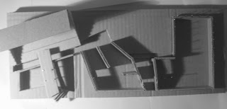
This is a 1:200 scale conceptual model of my initial Coogee Design. The design idea came from a "broken lock" resembling the community centre's defiance against its surrounding context.
WHY: because every other building was squashed next to each other in boring blocks and fences and barriers were preventing the community from getting to know each other. My design would be more broken up and allow for transitional spaces as well as allowing better access to the community centre helping Coogee reunite. These transitional spaces were going to be the areas that incorporated landscape linking INFRASTURUCTURE,THRESHOLD and RECIPROCITY.
Subscribe to:
Posts (Atom)