This set of photos and drawings show stages leading up to the final design. At this moment I have settled on the form of the building as it allows solar access for its own apartments and neighboring properties, has all the apartments with a view of Coogee beach (Pattern Still Water), has separate areas for private and public and looks at first attempts for window styles, balconies, bedroom layouts and overall plans.
Some issues that I found was the entrance to the apartments wasn't solved, room layouts were preventing solar access to rest of the apartment and the carpark could only fit 5 cars into it.
Beach Street Facade
Arcadia Street Facade and its relatonship on local context
Street view from North of Beach st
View from South of site on Beach st
Aerial view from South
Plan view
North Facade with balconies
Carpark
Jazz Club
Cafe
Apartment level 1
Apartment level 2
Apartment level 3
Thursday, 14 May 2009
Exercise 3 - 1:1 Section
The aim of this exercise was to get a sense of scale of the building in terms of wall widths and heights with thought going into the connection of each floor to ceiling to the above/below level. I chose to do the basement and the 3 others in my group did the other 3 levels of the building. There wasn't enough space for all the drawings to be laid out and viewed so I only have images of my own section.
There were problems where my basement ceiling met the ground floor because the stairs were right on the edge of the footpath and height resolution wasn't exact, but approximately where an entrance should have been. The important factor was the joining of the wall to the ground floor. Through research, my partner and I found that reinforcing the two structures was the way to go with precast concrete construction.
There should have been more waterproofing around the entire strip footing to prevent any water ingress and an additional agricultural pipe under where the floor slab meets the footing. Though recognising that the need for the damp proof course and pipe was an important part of this exercise.
Exercise 1 - Second attempt & Exercise 2 - shadow analysis
Second Attempt
THESIS
The idea that helped me derive the form for this design was to produce "Architecture that was in harmony with the landscape" or an "architecture that represented the local topography of the site". In the little sketches on the top left of the drawing below we can see this notion. In the end the site was a little too small for all the buildings to fit into and some apartments weren't receiving any natural sunlight. It was a good starting point though.
In these Google sketchup model images, we can see the 3d form of the building and the shadows that may affect the neighbouring buildings. The heights of the building work well with respect to the Heritage building behind and this is one of the patterns that I've selected, SACRED SITES. There are only 4 images for each hour, 9am to 12pm, because after 12pm the heritage building overshadows the building on the south side of the site and my building no longer has an affect.
9am winter solstice shadows
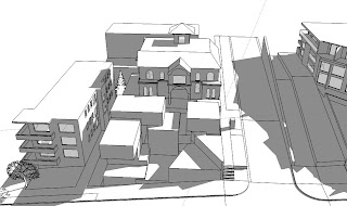
10am winter solstice shadows
11am winter solstice shadows
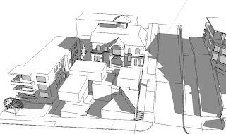
12pm winter solstice shadows
ANTI-THESIS
The thesis was too "blocky", very spread out and didn't have solar access to all apartments. So in the anti-thesis I went for a circular form which was more economic in its building footprint, had more than the minimum allowable area for all apartments, introduced the idea of an elevator core and gave some space back to the public. The entire north-east and north-west of the building would have solar access, which is another positive.
The negative aspects were that its height was a little over the limit and it would totally stand out from the existing streetscape, which can also be a positive thing.
This exercise did help me experiment with different shapes and forms so that a final design could be accomplished. I was accused of "shape-making" by the tutors when it is all a part of the process that led to a better design solution by me later on.
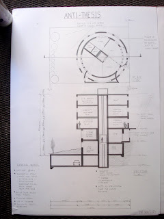
Anti-thesis Solar Study
9am Winter Solstice
10am Winter Solstice
11am Winter Solstice
12pm Winter Solstice
SYNTHESIS
Due to time constraints, there aren't any drawings for the synthesis, only a Google sketchup model showing the 3d form and the shadow analysis.
The synthesis is placed at the far north-east corner of the site as this is the area that imposes less overshadowing on both the heritage and building to the south. There is a void at this corner to allow for light and ventilation. Both sides of the building have great solar access. All apartments had great views to Coogee beach which was one of the patterns "Still Water".
The negative aspects included the small scale of the eastern side, which was going to be used for the elevator core. In this attempt I also tried going for split level apartments but the circulation needed for the building bulk was unsuccessful.
9am Winter Solstice
10am Winter Solstice
11am Winter Solstice
12pm Winter Solstice
THESIS
The idea that helped me derive the form for this design was to produce "Architecture that was in harmony with the landscape" or an "architecture that represented the local topography of the site". In the little sketches on the top left of the drawing below we can see this notion. In the end the site was a little too small for all the buildings to fit into and some apartments weren't receiving any natural sunlight. It was a good starting point though.
In these Google sketchup model images, we can see the 3d form of the building and the shadows that may affect the neighbouring buildings. The heights of the building work well with respect to the Heritage building behind and this is one of the patterns that I've selected, SACRED SITES. There are only 4 images for each hour, 9am to 12pm, because after 12pm the heritage building overshadows the building on the south side of the site and my building no longer has an affect.
9am winter solstice shadows
10am winter solstice shadows
11am winter solstice shadows
12pm winter solstice shadows
ANTI-THESIS
The thesis was too "blocky", very spread out and didn't have solar access to all apartments. So in the anti-thesis I went for a circular form which was more economic in its building footprint, had more than the minimum allowable area for all apartments, introduced the idea of an elevator core and gave some space back to the public. The entire north-east and north-west of the building would have solar access, which is another positive.
The negative aspects were that its height was a little over the limit and it would totally stand out from the existing streetscape, which can also be a positive thing.
This exercise did help me experiment with different shapes and forms so that a final design could be accomplished. I was accused of "shape-making" by the tutors when it is all a part of the process that led to a better design solution by me later on.
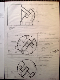
Anti-thesis Solar Study
9am Winter Solstice
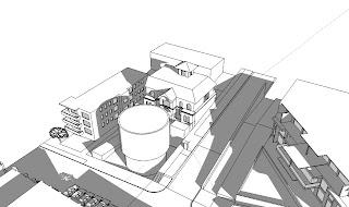
10am Winter Solstice
11am Winter Solstice
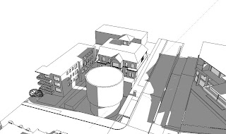
12pm Winter Solstice
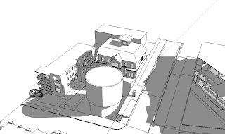
SYNTHESIS
Due to time constraints, there aren't any drawings for the synthesis, only a Google sketchup model showing the 3d form and the shadow analysis.
The synthesis is placed at the far north-east corner of the site as this is the area that imposes less overshadowing on both the heritage and building to the south. There is a void at this corner to allow for light and ventilation. Both sides of the building have great solar access. All apartments had great views to Coogee beach which was one of the patterns "Still Water".
The negative aspects included the small scale of the eastern side, which was going to be used for the elevator core. In this attempt I also tried going for split level apartments but the circulation needed for the building bulk was unsuccessful.
9am Winter Solstice
10am Winter Solstice
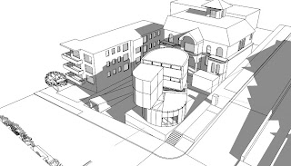
11am Winter Solstice
12pm Winter Solstice
Exercise 1 - Designing using a THESIS, ANTI-THESIS and SYNTHESIS
FIRST ATTEMPT
THESIS
The exercise involved starting with an idea as a Thesis and challenging that idea with an Anti-thesis and resulting in a Synthesis, which either brought the best parts of the two ideas together or just the one that stood out as the better design. We also had to account for the 5 patterns that we chose. The 5 patterns that I chose include:
• Building Edge - attracting people to the cafe
• Still Water - which relates to views
• Beer Hall - Jazz club
• Degrees of Publicness - separation of private and commercial spaces.
• Sacred Sites - Respecting the local context and heritage value.
There was no major idea pushing the building design forward apart from trying to get sunlight into the building, ventilation, complying with setbacks, using all the patterns in the design and fitting the building bulk onto the site.
All three schemes were unsuccessful because I took the wrong approach to the exercise. The only positives that came out of this attempt was the discovery of certain site lines, where and when the sun has an effect on other buildings and what size the buildings have to be in order to fit in all the apartments, cafe, carpark and jazz club.
ANTI-THESIS
SYNTHESIS
Site Analysis - Design Studio 5
Site: Corner BEACH and ARCADIA street, COOGEE NSW 2034
This Elevation and Section serve to show what the existing streetscape of the site looks like and the slope of the Beach Street facade.I found the slope to be roughly 6 degrees incline. I chose to draw the buildings behind and the Heritage building (Rosilyn Mansion), existing cafe/restaurants that currently occupy the land and the units across the road to see the relationships in height and building sizes. Due to the steep incline/decline of the site, the current cafe/restaurants have a very small effect on the surrounding buildings in terms of height and view obstruction.
This 1:500 Site survey looks at the building numbers and heights in terms of storeys, roads and footpaths as well as trees and shrubbery in the local context. I did a little extra research into the site's listing in the Randwick DCP and found that the Beach St facade is of importance to the FORESHORE SCENIC PROTECTION line, which by definition helps prevent designs that make the streetscape look "unsightly". The soils in and around the block of land are in a high level of Acid Sulfate Soils, so we are going to have to take extra precaution when going underground for the Carpark/Jazz Club.
In this 1:100 section through the site, I tried to analyse the site like the DCP and RFDC recommend where neighbouring windows, view obstruction, heights, overshadowing and setbacks are considered. This is a more detailed analysis that looks at the immediate context of the site.
In this 1:100 section we can see that using the maximum height from the south end to the north will have an effect on the Heritage building's facade and their views of the ocean. Another factor that was apparent is that with all the setbacks restricting our building footprint on the site, there simply isn't enough land for us to design for all the amenities. [3.5m minimum to the sides, 6m to the rear] We can object the setback of the Beach street and Arcadia street facades as it already has existing land-use rights.
Subscribe to:
Posts (Atom)